G1K1 Veteran Clothing

Branding

This apparel project was designed for a client launching a specialized clothing range dedicated to South African Military Veterans. The goal was to tap directly into the shared culture, dark humor, and pride of the old SANDF era. Rather than creating generic military shirts, the artwork for the T-shirts and hoodies instantly resonates with veterans who lived through the intense physical grit of ‘vasbyt en opfok’. To make the apparel feel genuine and field-tested, the design system avoids clean vector lines in favor of heavily distressed textures, stencil typography, and iconic military terminology.
 
(“Vasbyt” translates to grit/perseverance; “Opfok” refers to intensive, grueling training).

The Paratrooper Design (“Vleisbom”): “Features a bold stencil typeface paired with a gritty silhouette of static-line paratroopers dropping from a transport plane. It proudly incorporates the legendary airborne nickname ‘Vleisbom’ and references the historic Rooiplaas training base.

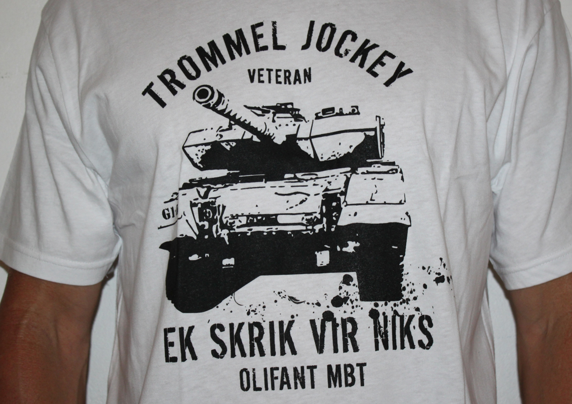
The Armor Design (“Trommel Jockey”): Centers on a high-impact, ink-splattered illustration of the iconic Olifant Main Battle Tank (MBT). The text uses a striking contrast of clean and distressed fonts, featuring the classic tanker nickname ‘Trommel Jockey’ alongside the unapologetic phrase ‘Ek Skrik Vir Niks’ (I fear nothing).

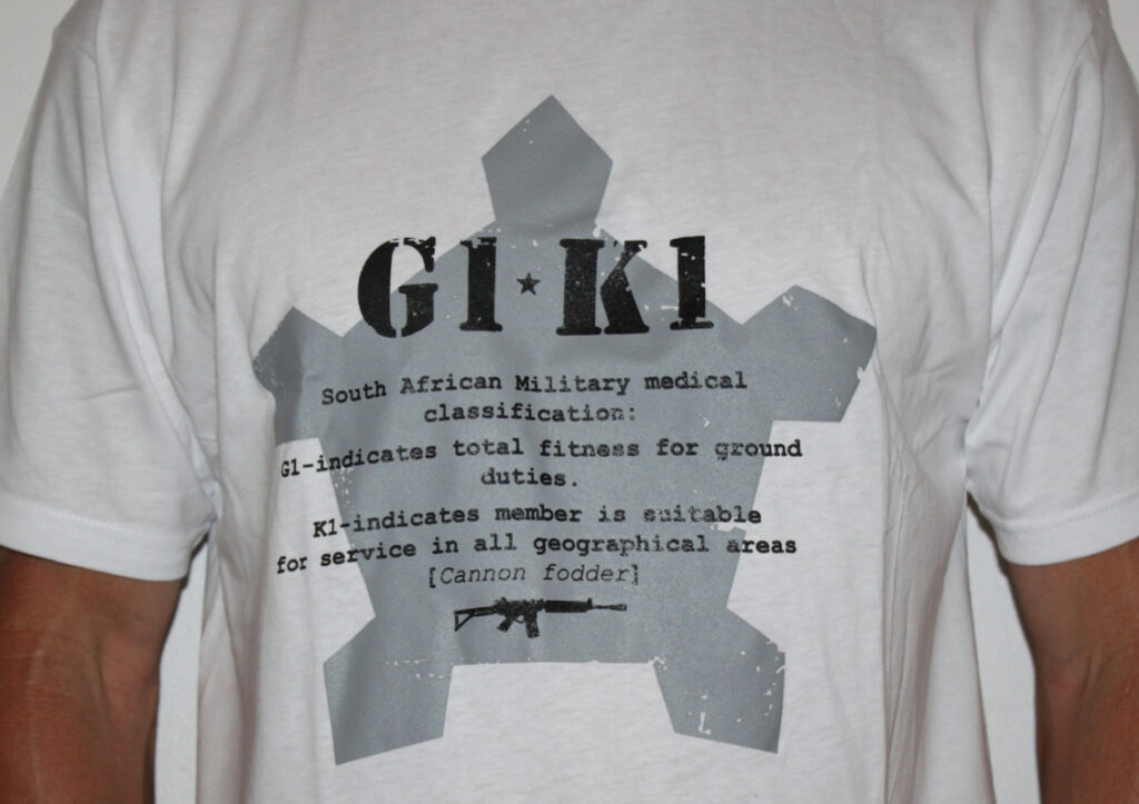
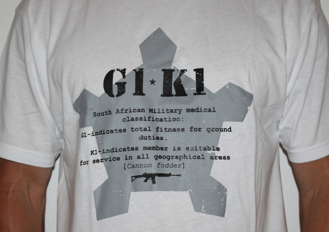
The Classification Design (“G1-K1”): Recreates the official military medical classification system on top of the iconic Castle background shape of the Defence Force insignia. It uses a raw typewriter font to spell out the stark reality of the G1-K1 status (Total fitness for ground duties / Suitable for service in all geographical areas), complete with the veteran community’s cynical translation: [Cannon Fodder].

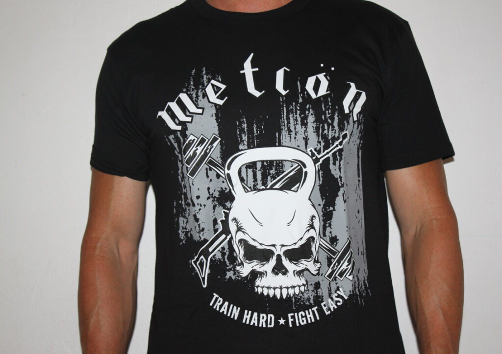
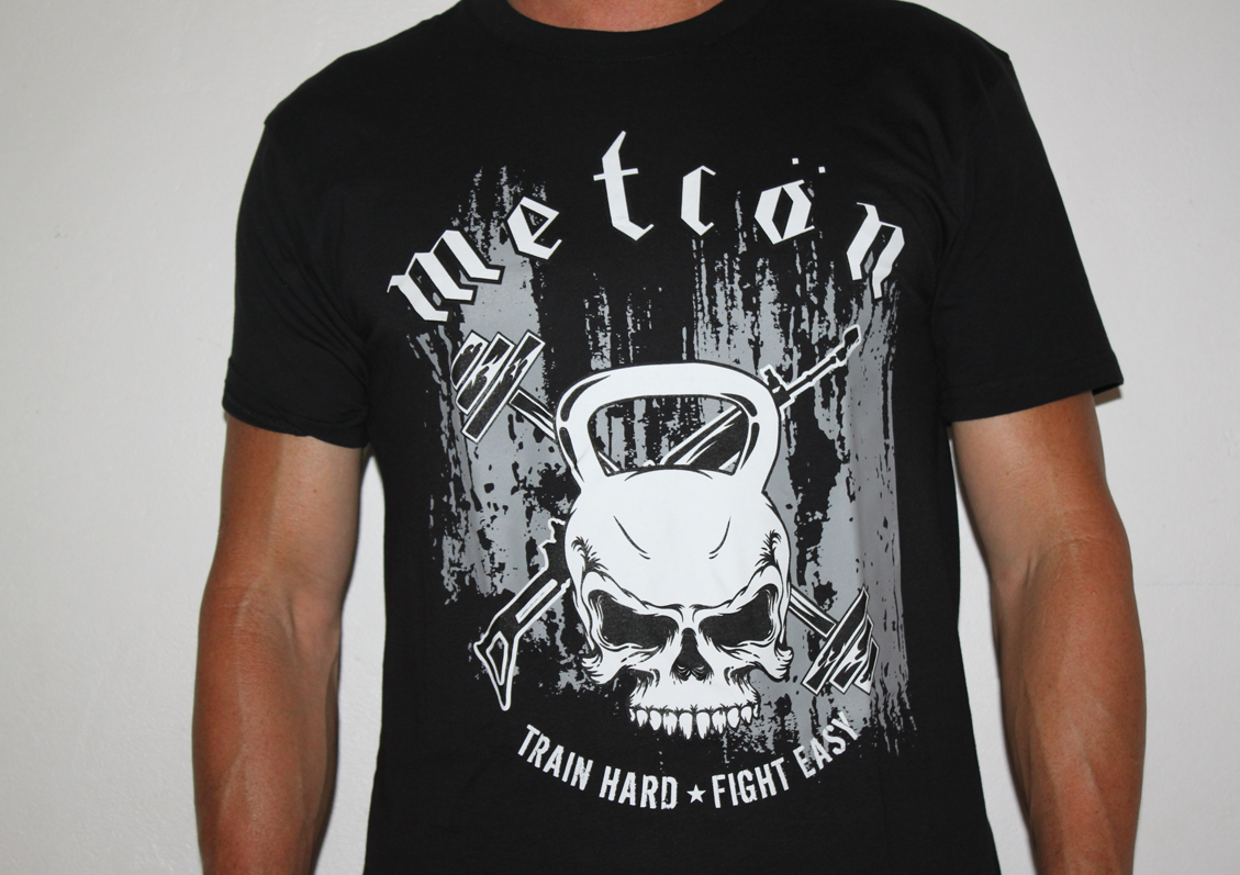
The Training Design (“Metcon”): A high-intensity physical training graphic combining a kettlebell and skull motif with crossed R4 rifles and a barbell. This design bridges the gap between old-school military grit and modern tactical fitness style, anchored by the motto ‘Train Hard • Fight Easy’.

Technical Specifications:
 
Project Scope: Merchandise & Apparel Graphics, Creative Art Direction
 
Design Styling: Distressed Print Textures, Custom Vector Illustration, Military Stencil & Typewriter Typography
 
Production Medium: Optimized for High-Density Screen Printing and Direct-to-Garment (DTF) apparel application

 
Navigating a project with such deep historical roots meant listening closely to the veterans’ own stories and inside humor. My focus was on capturing the true spirit of the era without smoothing over the rough edges that make it authentic. By combining heavily weathered textures and classic stencil typography with iconic symbols like the Olifant tank and Castle insignia, I wanted to create designs that feel field-tested. It was a balancing act of respecting military history while creating bold, modern streetwear that veterans can wear with genuine pride and a sense of shared brotherhood.

Mike Mapson
Owner – G1K1 Military T-shirts

Karen was instrumental in helping me get a T-Shirt Company that I own off the ground. I have quite a vivid imagination and struggled with the designers I worked with in the past, as they just could not get what I wanted in my head onto paper. Karen was spot-on every time. She is fun to work with, very creative and always gets the requested artwork to me on time. I highly recommend her services to anyone out there looking for a designer.